SuiteCRM Activity Hooks for Account-Level Call Tracking
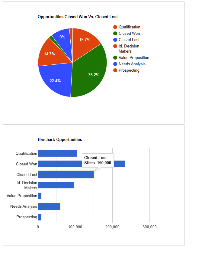
This SuiteCRM customization project delivers powerful data visualizations directly to user dashboards using Google Charts. By leveraging custom SQL queries, entry points, and JavaScript integration, we created a series of real-time, visually engaging KPI metrics for sales reps and managers.
Challenge
Out of the box, SuiteCRM’s dashboards offer limited charting capabilities and lack the flexibility to display complex, customized KPIs or aggregated data across multiple modules. Managers needed quick insight into team performance, pipeline movement, and other key sales metrics—all in one place.
Solution
We implemented a dynamic dashboard solution that integrates Google Charts with SuiteCRM through:
✅ Features Implemented:
- Custom entry points to serve Google Charts JavaScript securely.
- Custom SQL queries to retrieve real-time KPIs from modules like Opportunities, Leads, and Quotes.
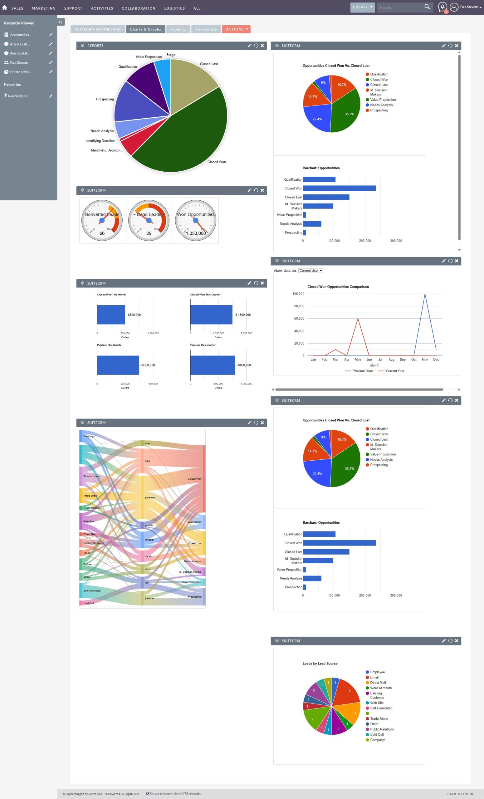
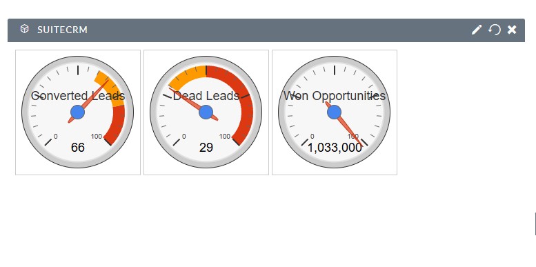
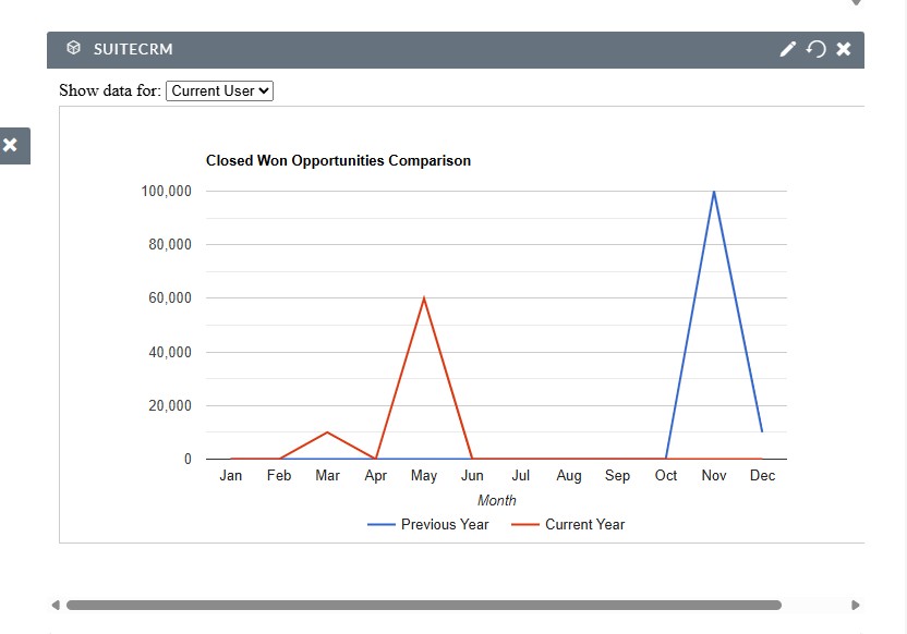
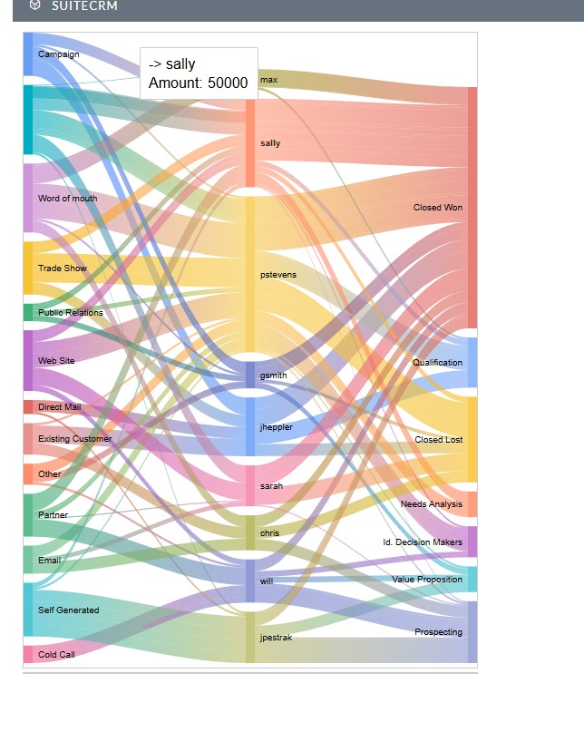
- Multiple chart types supported (bar, pie, column, gauge, Sankey, line, etc.).
- Embedded charts in SuiteCRM homepage dashboard via custom dashlets.
- User- and role-specific views for tailored insights.
Technical Approach
- Created secure, whitelisted custom entry points under
/index.php?entryPoint=...for each chart. - Generated data in JSON format consumed by Google Charts.
- Added custom JavaScript templates and CSS for layout/styling.
- Leveraged SuiteCRM dashlet framework to embed charts into dashboards.
- SQL queries optimized to avoid performance hits on large datasets.
Impact
✅ Instant visualization of critical KPIs
✅ Improved decision-making through at-a-glance metrics
✅ Enhanced dashboard usability for all user roles
✅ Modular design for future chart additions