This is the first article in a series I’m going to be writing about some bad website design ideas. Almost every time I build a website these are some of the top “modifications” clients want after they see the website. However, most of them are not great website design ideas and I’m going to explain why in this series of articles. The intent is to educate my clients on why I’ve made many design choices in the first draft of the website.
Make the Logo Bigger
Make the logo bigger is by far the most common request I get after I submit a design to a client. Usually, within minutes I get an email saying “I like it, but can you make the logo bigger?”.
Of course I can make the logo bigger, but here is why I usually say it’s a bad idea.
It pushes the content down the page.
Clients are on your website to learn about your products or services NOT to see your giant logo!
Here’s an example of an appropriate sized logo. It’s visible, legible and doesn’t overwhelm the page. Plus, it ensures the header is a reasonable size (height).
![]()
Next is a “BIGGER LOGO”.
You can see it pushes the content further down the visible page because the header needs to be bigger to accommodate the GIANT LOGO.
![]()
I encourage client to do some research. Look at some big brands and see how big their logo is. For example, let’s have a look at Apple, on of the biggest brands in the World.
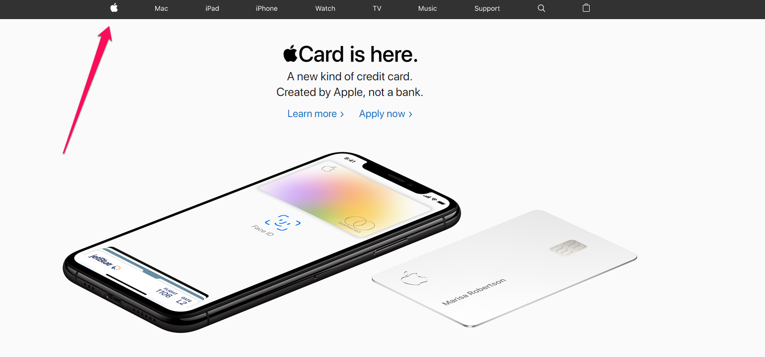
The lesson here is “less is more”. People are not on your website to see your logo. People visit your website because they are looking for information. The bigger your logo is, the further the content your clients are there to see is pushed down the page. See how Apple is showcasing a BIG GIANT PRODUCT instead of a big giant logo?